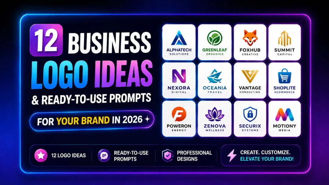
12 Business Logo Ideas & Ready-to-Use Prompts for Your Brand in 2026
Explore 12 creative logo ideas with ready-to-use prompts for startups and brands. Discover modern logo design ideas, build mood boards, and bring concepts to life faster using Vmake Labs AI.

Every great brand started with a napkin sketch or a folder of messy screenshots. Finding the right logo ideas isn't about waiting for a flash of genius. It's about experimenting with shapes, moods, and layouts until a concept lands. Whether it's a tech startup or a neighborhood store refresh, the combination of real-world visual research and custom AI prompts turns raw ideas into a one-of-a-kind visual identity.
What makes a great logo idea?
The most recognizable brands in the world share one thing in common: a central big idea logo that drives the design. This core idea logo conveys brand values instantly and without any visual clutter. The difference between a memorable idea logo and a generic template is rigorous practical stress tests. Squeezing a mark down to a browser favicon of 16x16 pixels quickly exposes structural problems. Strip color tests monochrome legibility. Analyze palette decisions in global markets to avoid cultural pitfalls. Simple geometry will almost always trump complex complexity, so vector scalability and clear typographic hierarchy are priorities from day one.
Core elements every successful logo shares
-
Simplicity: Stripping away non-essential decoration
-
Memorability: Creating an instant visual hook
-
Timeless appeal: Avoiding short-lived graphic trends
-
Relevance: Aligning visual cues with industry expectations
-
Versatility: Performance across billboards, mobile apps, and product packaging
-
Balanced typography: Pairing fonts that reflect brand personality
-
Strong color palette: Using 1–3 purposeful colors
-
Unique visual identity: Ensuring distinctiveness within your industry
12 logo ideas to inspire your next brand identity
To find good business logo ideas, you need to look into the industry you are in. An edgy neon crest, for example, is rarely right for a traditional law firm. In the breakdown below, 12 basic directions to assist designers in discovering a variety of logo design ideas and to determine the appropriate aesthetic path for any brand.
|
Logo Style |
Best For |
Key Characteristics |
Pro Designer Tip |
|---|---|---|---|
|
Minimalist Logo |
Tech startups, modern agencies |
Clean typography, negative space, no clutter |
Works best when tested at 16x16px for favicons |
|
Monogram Logo |
Personal brands, luxury fashion |
Initial-based identity, intertwined letters |
Focus on custom kerning to avoid generic font looks |
|
Mascot Logo |
Gaming, esports, food brands |
Friendly illustrated character, expressive |
Ensure the mascot has a simplified outline version |
|
Vintage / Retro Logo |
Coffee shops, craft beer, denim |
Classic typography, textured badges, seals |
Test legibility without distressed texture overlays |
|
Geometric Logo |
SaaS, fintech, architecture |
Precise shapes, symmetry, grid systems |
Use mathematical grids to establish visual trust |
|
Abstract Logo |
Innovative brands, global corps |
Unique symbolic forms, conceptual shapes |
Ideal when your brand name doesn't explain your service |
|
Hand-Drawn Logo |
Artisanal goods, organic products |
Organic appearance, sketchy line work |
Digitize drawings into clean vectors to prevent pixelation |
|
Luxury Serif Logo |
Premium beauty, jewelry, wine |
Elegant serif fonts, high contrast, gold/monochrome |
Pair with generous whitespace for high-end appeal |
|
Gradient Logo |
Web3, media apps, digital tools |
Modern color transitions, vibrant blends |
Always design a solid flat-color fallback for print |
|
Lettermark Logo |
Enterprises with long names |
Initial-focused branding (e.g., IBM, HBO) |
Prioritize distinct letterforms over complex symbols |
|
Emblem Logo |
Universities, sports teams, badges |
Text enclosed inside a symbol or crest |
Keep inner text large enough to read on embroidery |
|
Combination Logo |
Most small-to-mid businesses |
Paired icon + typography (stacked or horizontal) |
Build modular layouts so icon and text can separate |
Selecting a general look is only the beginning. You have to translate structural ideas into AI generator prompts using deliberate language. Below are 12 off-the-shelf prompts, each with a summary of the core mechanics of the style, that are a blueprint for creating clean, commercial-ready artwork in major branding categories.
-
Minimalist Logo Ideas
Minimalism demands structural discipline. Removing non-essential decoration, the focus is drawn to line weight, negative space and typography. It's the choice of modern tech companies and creative agencies, because of its understated confidence that works across media, from billboards to smartwatch screens.
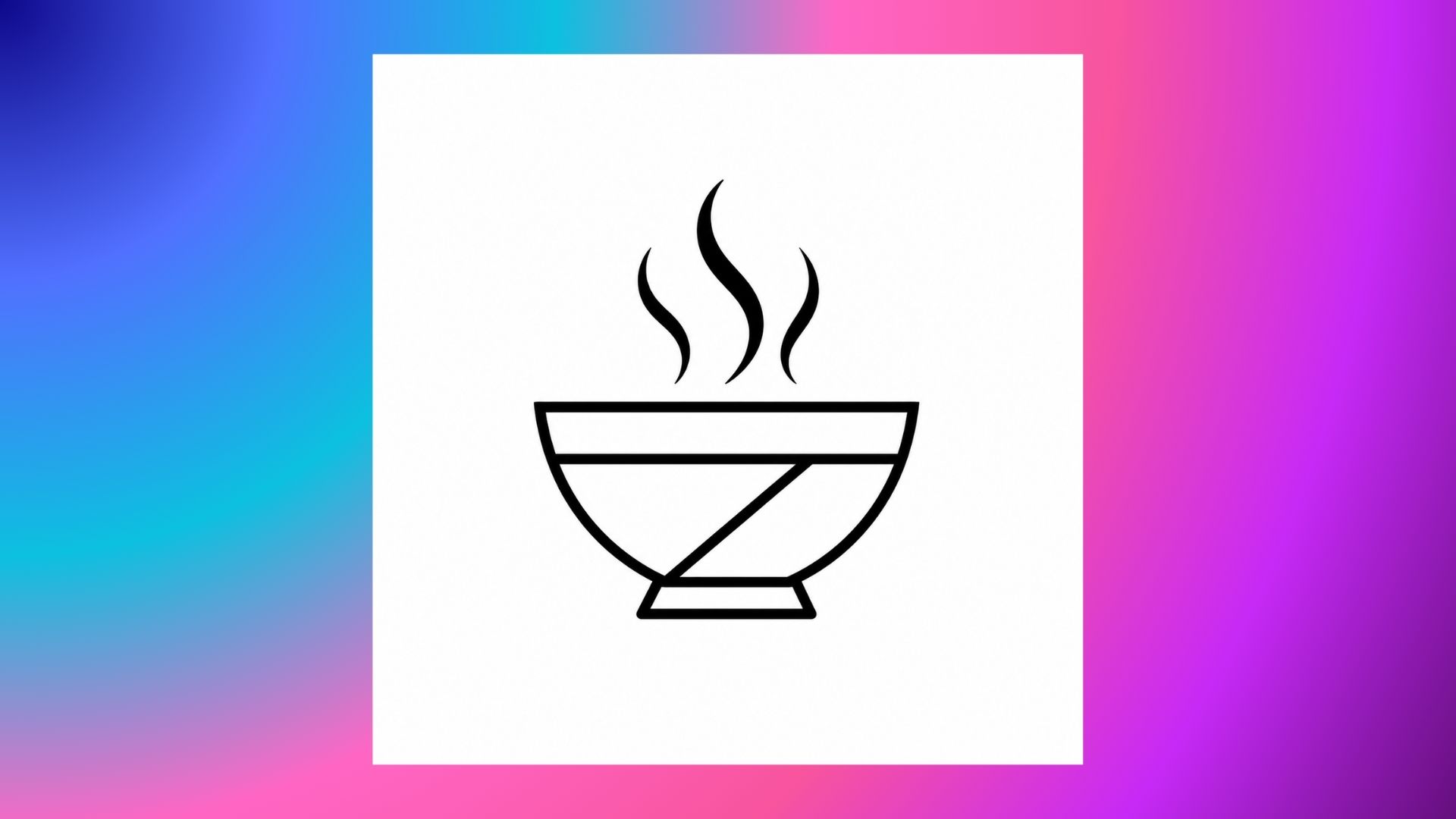
Prompt: Flat minimalist food logo design of an abstract geometric bowl with stylized steam lines rising, crisp black outlines on pure white background, generous negative space, sleek modern aesthetic, vector graphic, no gradient, no text --ar 1:1
-
Monogram Logo Ideas
Monograms combine company initials into one signature emblem. Luxury fashion houses, fine jewelers and bespoke consultancies use this format to communicate heritage and authority. Fine adjustments to kerning and stroke overlaps can turn standard letterforms into proprietary art.
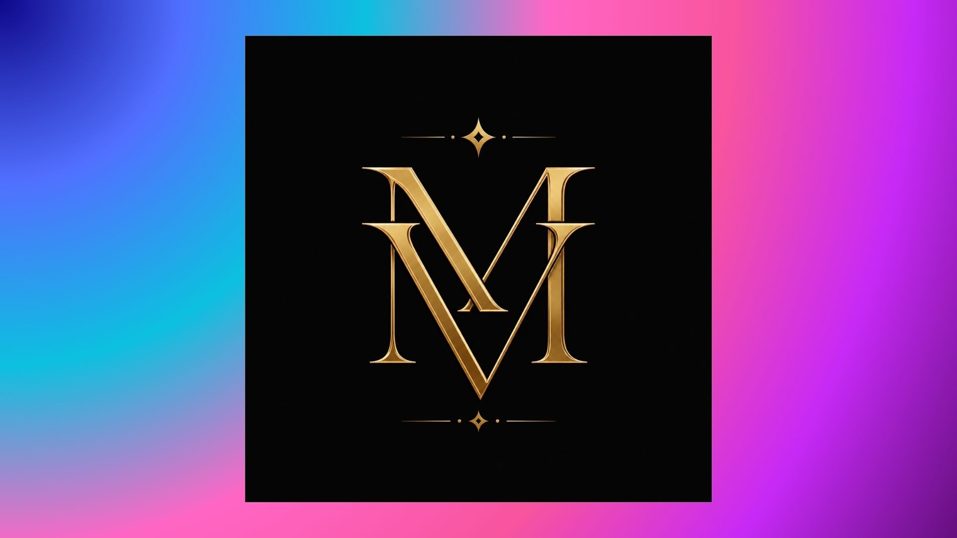
Prompt: Monogram logo in luxury style, intertwined letters M and V, elegant serif font, metallic gold line art on deep matte black background, balanced composition, high-end fashion branding, vector icon --ar 1:1
-
Mascot Logo Ideas
A mascot gives a brand a face that is immediately recognizable. Illustrated characters are very effective for gaming platforms, cafes and community driven brands, giving personality and emotional warmth. Keeping a clean silhouette helps the character stay distinct on mobile screens, even when playing around with ChatGPT images in the early conceptual sketching phase.
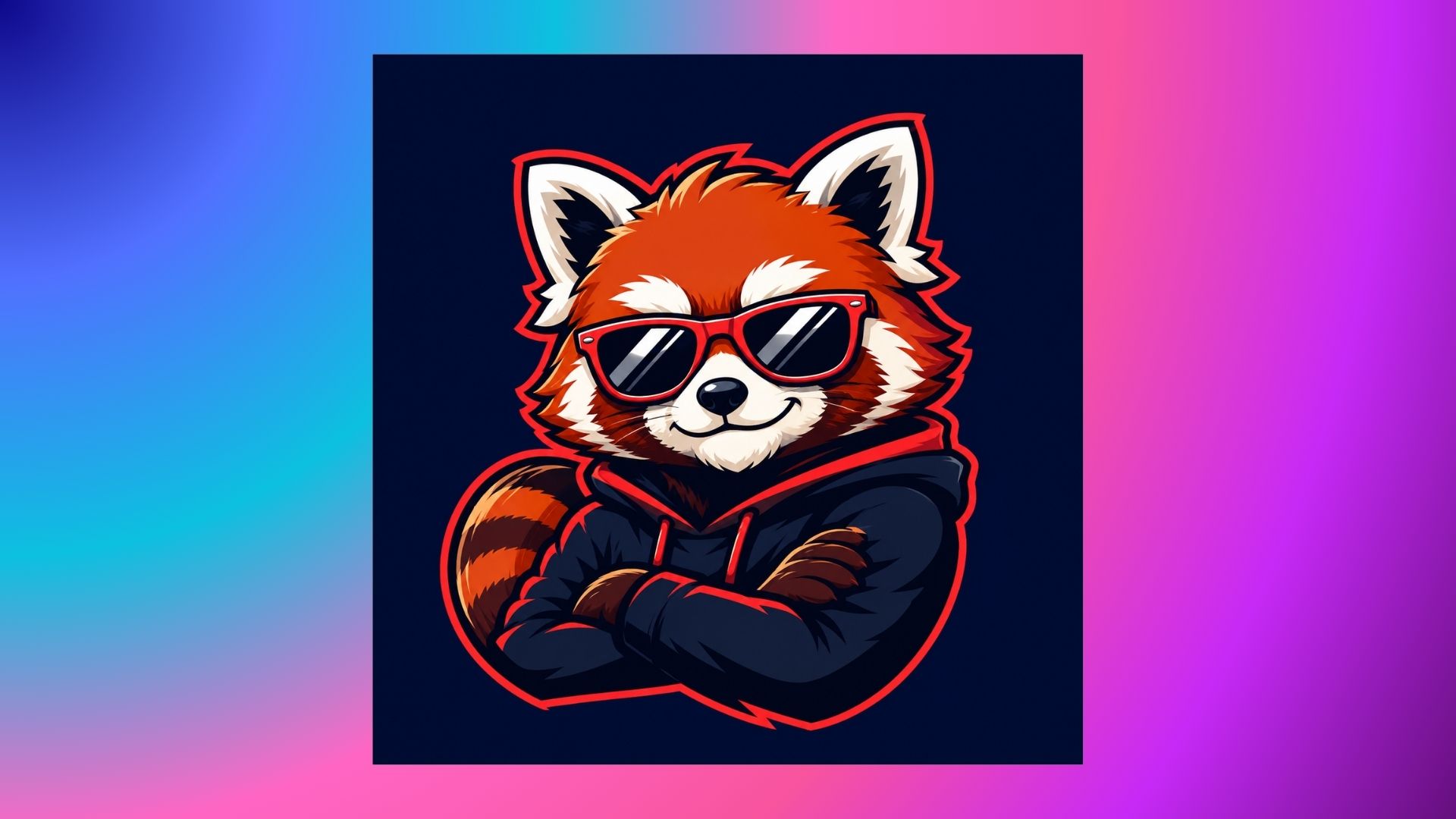
Prompt: Dynamic mascot logo of a smart red panda wearing vintage sunglasses, thick bold vector outlines, bright esports design, lively shading, on a solid navy blue background, simple graphic emblem --ar 1:1
-
Vintage & Retro Logo Ideas
Vintage badges communicate heritage, authenticity and craftsmanship with classic typography and circular seals. These visual cues are a tried and true quality employed by coffee roasteries, craft breweries, and denim labels. Clean vector lines provide the base, keeping it readable and avoiding the need to stack on heavy distress overlays.
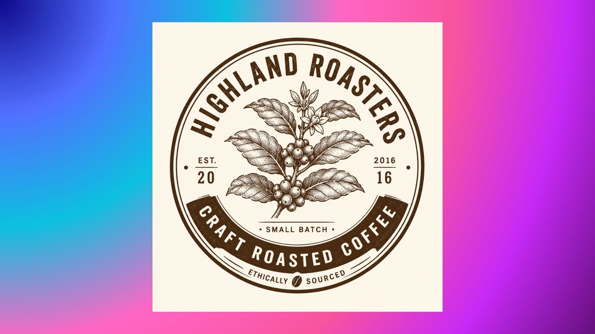
Prompt: Old craft roastery badge logo, round logo with etched coffee plant, classic thick industrial font, rustic earthy brown and cream colors, clean line vector art, vintage seal --ar 1:1
-
Geometric Logo Ideas
Geometric designs exude structure, precision and intelligence through mathematical grids and crisp polygons. In architectural firms and fintech platforms, intersecting shapes are common to signal technical rigor and reliability before a customer reads the brand name.
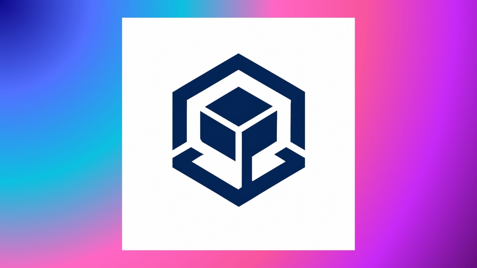
Prompt: Precision geometric logo design of a connected hexagon and cube, mathematical grid proportions, corporate fintech branding, monochromatic navy color scheme, clean architectural lines, flat vector emblem --ar 1:1
-
Abstract Logo Ideas
Abstract marks are conceptual forms that stand in for literal objects and imply movement, collaboration or transformation. Non-figurative symbols can make a brand more flexible and not tied to a specific product line if a company operates in a variety of sectors.
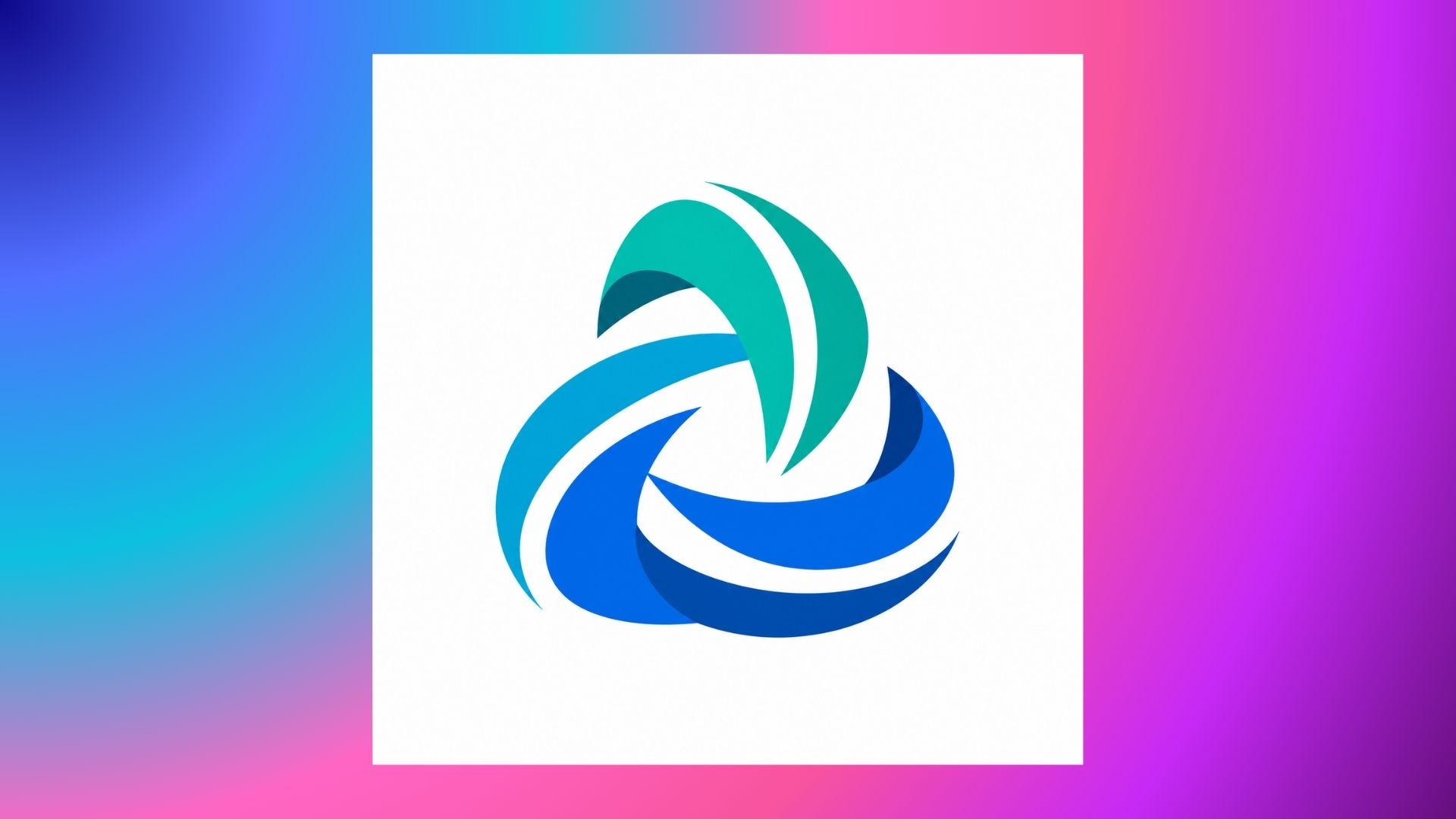
Prompt: Abstract symbolic logo showing collaboration and moving forward, three intertwining fluid ribbon shapes, sleek modern corporate look, vibrant teal and cobalt colors, flat vector graphic, clean background --ar 1:1
-
Hand-Drawn Logo Ideas
Hand-drawn logos celebrate organic imperfection and artistic warmth with sketch-like linework. Organic skincare labels, artisanal bakeries and boutique nurseries prefer this human touch. Rough drawings are digitized into clean vector anchor points. Digital sharpness with handcrafted authenticity.
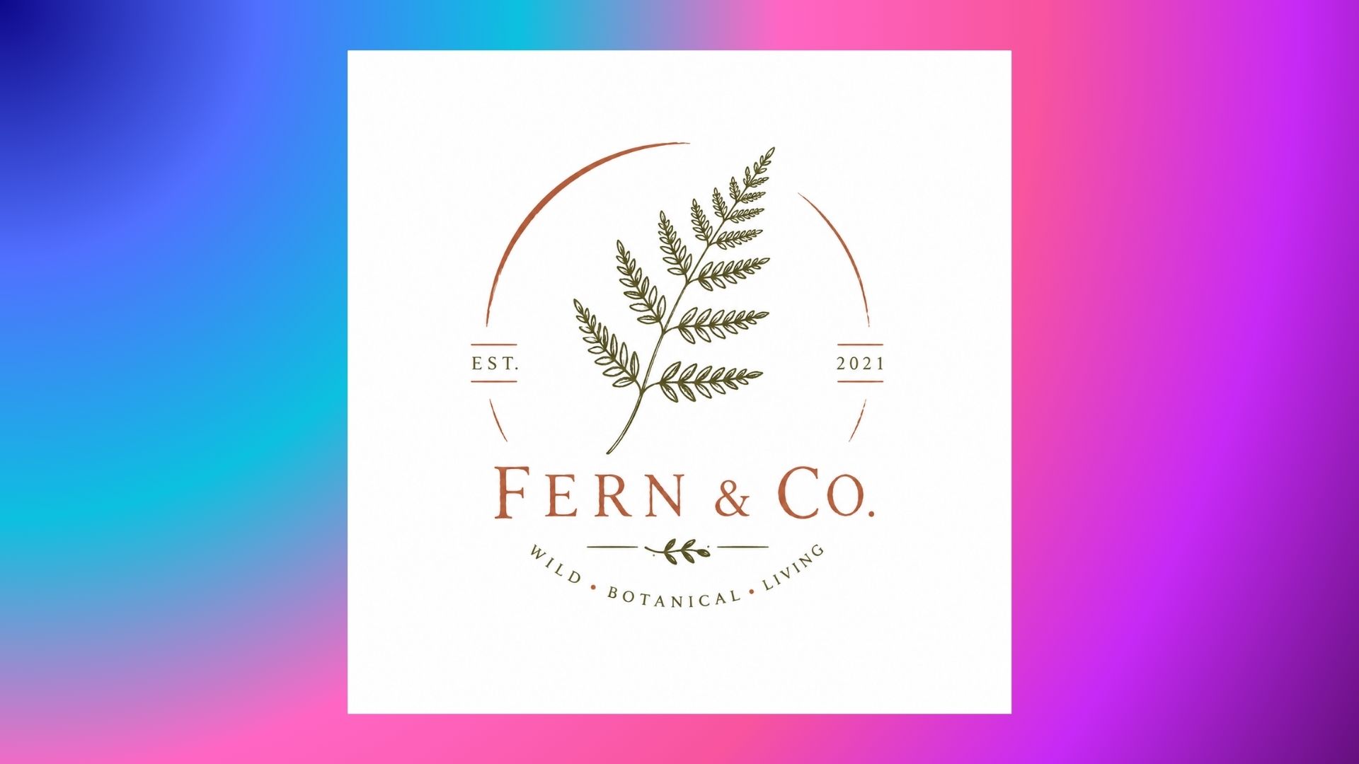
Prompt: Hand-drawn artisan logo of a wild botanical fern twig, organic imperfect linework, warm earthy terracotta and olive green color palette, rustic boutique branding, clean vector illustration, isolated on white --ar 1:1
-
Luxury Serif Logo Ideas
High contrast stroke weights, fine serifs and lots of open space make luxury serif identities feel commanding. Editorial typography is the choice for prestige winemakers, fragrance houses and luxury jewellery studios who want to communicate high-end value and longevity of sophistication.
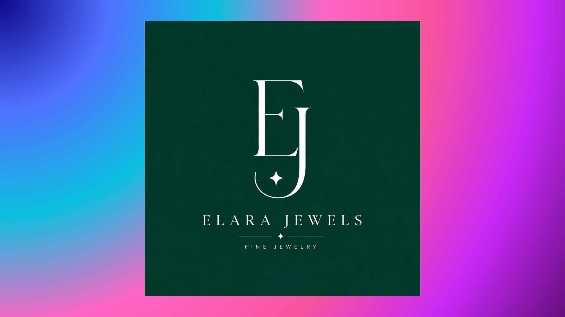
Prompt: Ultra-luxury serif logo mark, sophisticated high-contrast letterforms with fine serifs, minimalist luxury jewelry brand, a clean white logo on muted emerald green background, editorial elegance --ar 1:1
-
Gradient Logo Ideas
Gradients add depth, energy and motion with smooth color transitions. Software platforms, mobile apps and Web3 tools embrace glowing blends to signal forward momentum. First, make a good single-color fallback so that the emblem will work printed or embroidered.
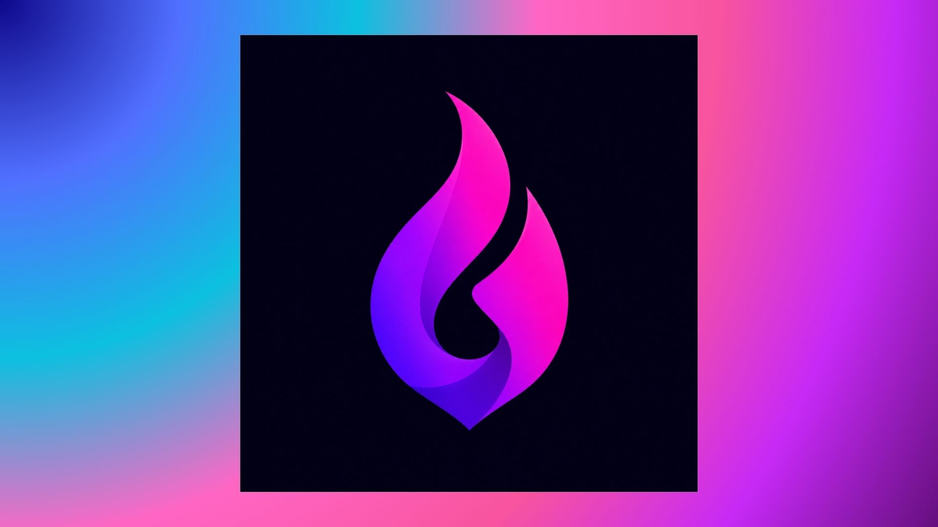
Prompt: Current gradient logo of an abstract digital flame, seamless bright color transition from neon violet to electric magenta, slick Web3 SaaS icon, dark mode background, sharp vector silhouette --ar 1:1
-
Lettermark Logo Ideas
Lettermarks take long company names and reduce them to punchy, memorable initials. Custom letter weights are used by media networks and enterprise software brands for instant recognition across digital platforms. Visual consistency across video channels and promotional assets is guaranteed with a strong lettermark.
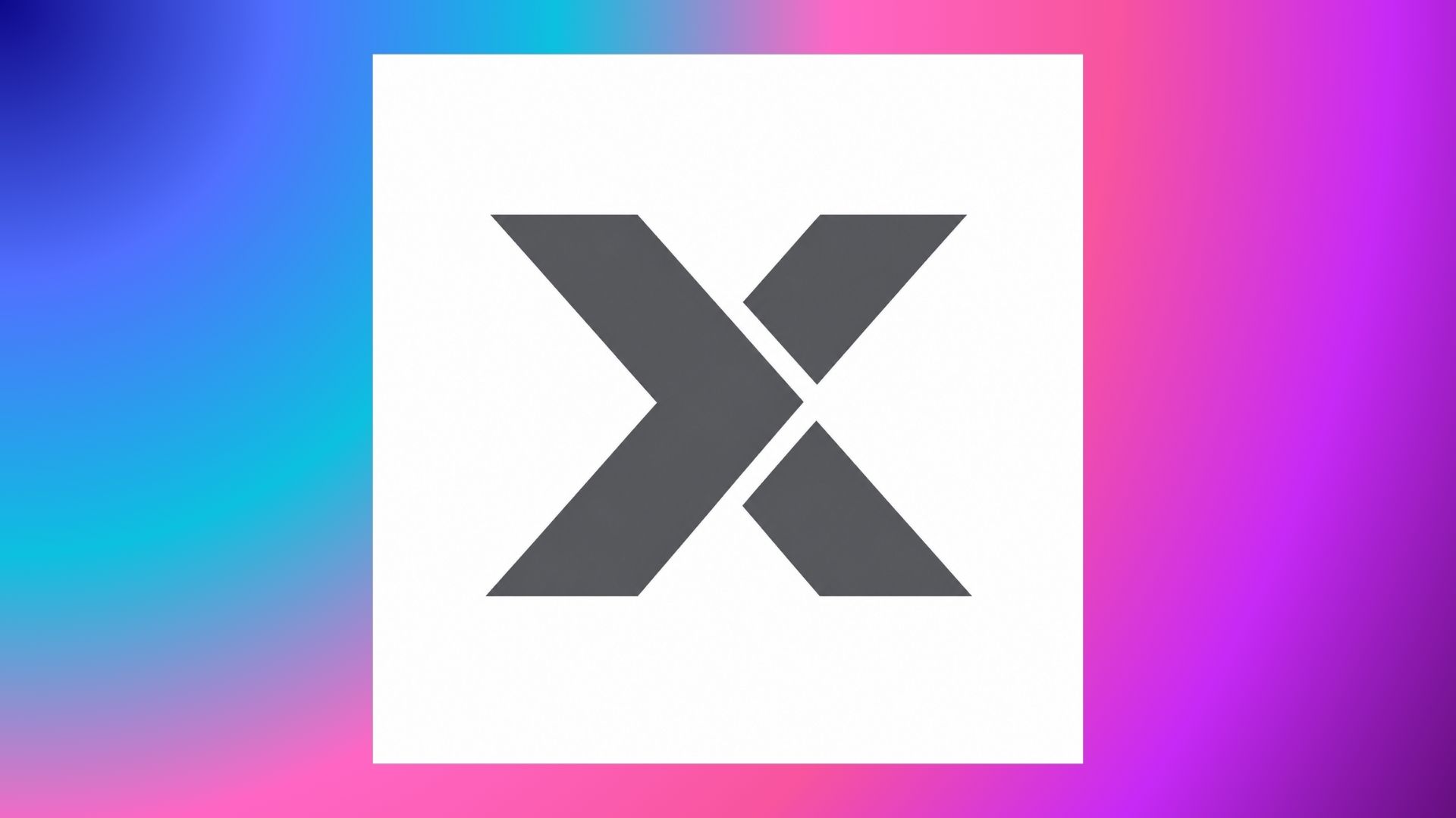
Prompt: Futuristic heavy weight typography, angular cuts, industrial branding, vector icon of letter X, solid slate gray, high impact corporate lettermark logo, white background --ar 1:1
-
Emblem Logo Ideas
Typography and iconography are surrounded by emblems in a crest, shield, or circular badge to express tradition and pride of group. These structured seals are popular with universities, athletic franchises, and civic organizations. The interior dimensions are generous, so text still shows up readable on embroidered patches and digital avatars.
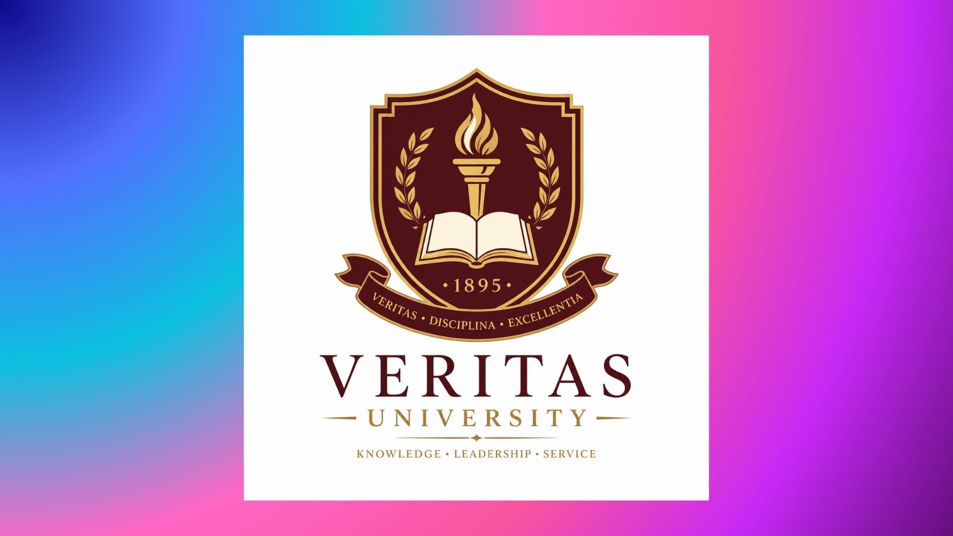
Prompt: Classic college badge logo, shield coat of arms logo with flame and open book, vintage serif font, deep red and gold color theme, minimal vector patch logo, authentic academic emblem --ar 1:1
-
Combination Logo Ideas
Combination marks combine an independent symbol with strong wordmark typography, offering growing companies maximum flexibility. The modular structure enables the graphic icon to stand alone as an app avatar while the full layout anchors official website headers and signage.
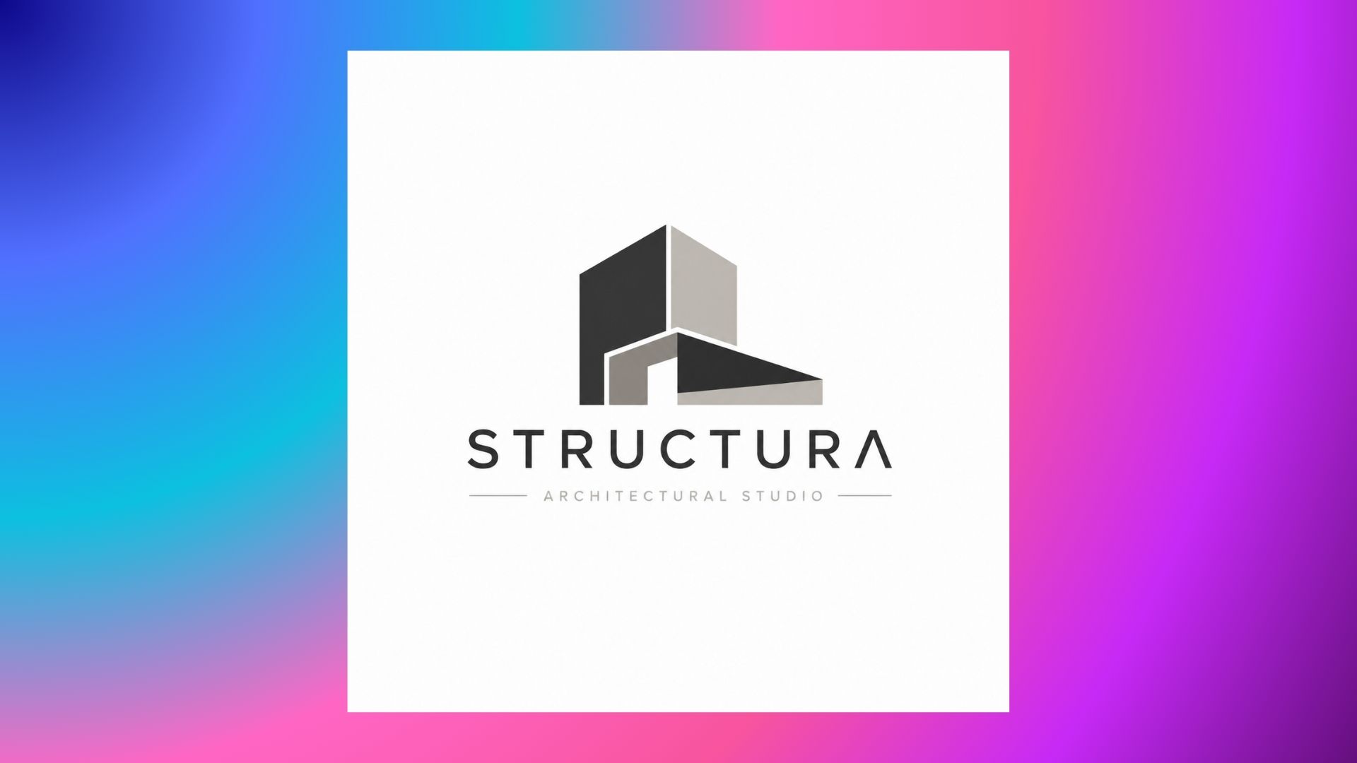
Prompt: Clean combination logo of modern architecture studio, abstract structural building block icon and sleek geometric sans serif wordmark, minimalist charcoal and warm grey color palette, vector layout --ar 1:1
How to find logo ideas using mood boards
It is rare that a professional visual identity starts from a clean slate. A structured mood board that includes imagery, textures, and color swatches transforms abstract brand values into a clear visual direction before writing prompts or sketching out layouts.
-
Gather broad mood board ideas for emotion and tone: Gather photography, architectural forms, and natural landscapes that convey the exact psychological response you want for your target audience.
-
Borrow niche fashion mood board ideas for upscale styling: Look at editorial lookbooks, textile swatches and high-contrast typography from fashion houses to inspire elevated monograms and refined serif identities.
-
Track 2026 mood board ideas for modern relevance: Use current design trends like warm minimalism, tactile surfaces, and modular grid systems to keep branding fresh, but avoid following fleeting trends.
-
Add rough mood board drawing ideas to explore geometry: Mix pencil sketches, geometric doodles, thumbnail outlines with digital reference clips to link conceptual ideas to concrete shapes. Check out curated creative prompts for exploration of character concepts to visualize 3D elements on a board layout.
Build a logo inspiration mood board in five steps
-
Define your brand personality: Mention 3-5 core adjectives that describe the tone and posture of the brand. These traits are established early on to prevent aesthetic drift into unrelated styles.
-
Collect typography references: Collect serif, sans serif and script font specimens that are in line with the brand profile. Letter spacing and terminal details are compared to show how small changes in font affect how people see things.
-
Save color palettes: Extract three-shade groupings from photos, nature or industry standard. Digital clarity can be maintained by limiting the choices to one primary anchor, one supporting shade, and one neutral accent.
-
Explore symbols and illustrations: Create new geometric relationships using organic silhouettes, mood board drawing ideas, and architectural patterns. Combining slick vector samples with rough pencil doodles opens surprising creative paths.
-
Organize visual inspiration into themes: Group visuals by emotional tones or aesthetic styles to quickly identify recurring patterns. We can obtain a unified direction for prompt generation by filtering out elements that are inconsistent with the main theme.
Once a mood board has provided a visual direction, swatches, textures and sketches can easily be translated into real marks. Rather than hand-writing dozens of early versions, creators can now use AI suites to try structural variations instantly.
Create unique logo ideas with Vmake Labs AI Image Generator
Translating mood board inspiration into polished brand concepts requires software built for creative speed and precision. As a comprehensive digital studio, Vmake Labs provides an AI image generator that allows creators to rapidly iterate on complex visual styles, test color palettes, and explore visual directions without starting from scratch. Leveraging the Vmake Labs image generator transforms raw abstract ideas into a grid of logo concepts and inspiration images in seconds. Once a direction is selected, the final logo can then be easily vectorized and proofed in tools like Illustrator or Figma for production-ready use.
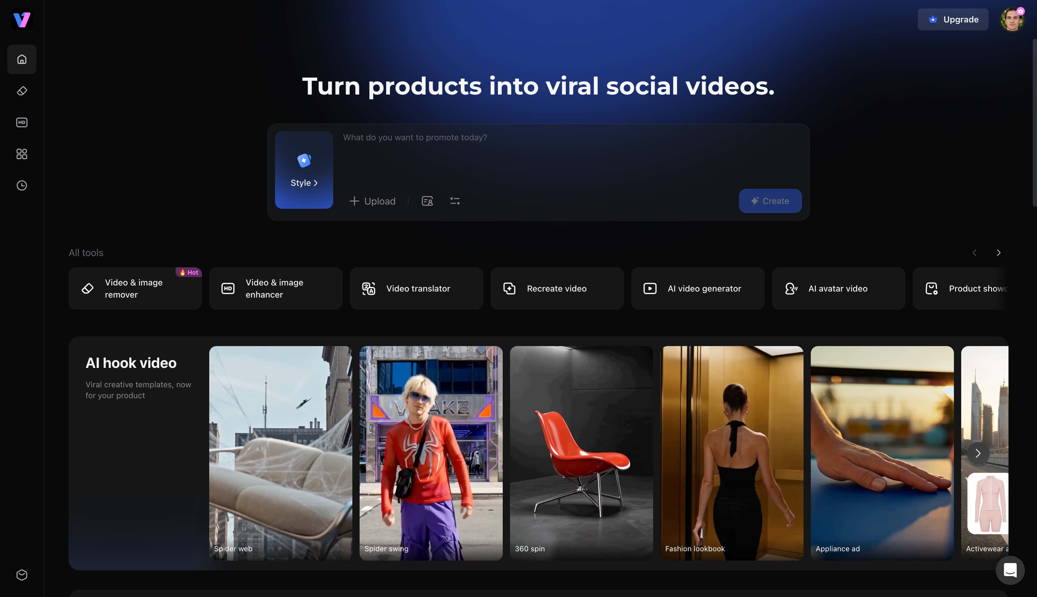
Key Features
-
Multiple leading AI image models: Vmake Labs has powerful generation architectures like Nano Banana 2, Nano Banana Pro, Seedream 4.0 and GPT Image 1, catering to diverse aesthetic needs from minimalism to complex illustration.
-
Text-to-image generation: Instantly turn descriptive prompt strings into sharp, high-resolution logo marks, icons, and branding concepts.
-
Image-to-image generation: Upload existing sketches, mood board drawings, or visual reference shots to guide the AI towards specific geometric structures and color harmonies.
-
Multiple aspect ratios: Create square 1:1 emblems for social avatars, horizontal layouts for website banners, or vertical cards for brand presentation sheets.
-
Commercial-ready image creation: Provide clean, well-proportioned graphics suitable for marketing materials, client presentations, and digital design workflows.
How to generate a brand logo using Vmake Labs
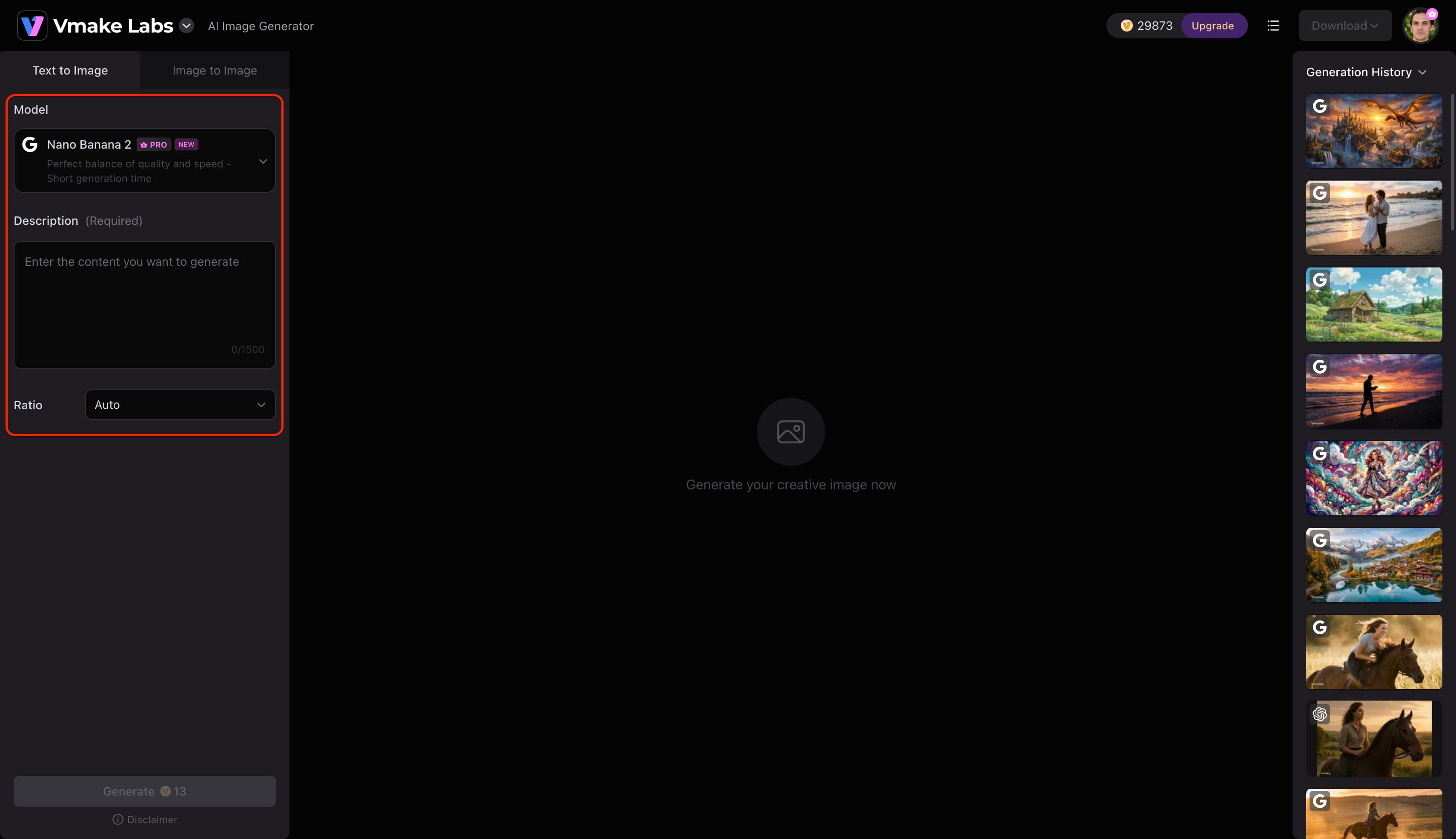
Step 1: Enter a text prompt or upload a reference image
Open Vmake Labs AI Image Generator and choose Text to Image or Image to Image. Upload up to 3 reference images to guide the generation or type a text prompt describing the brand mark you want to generate.
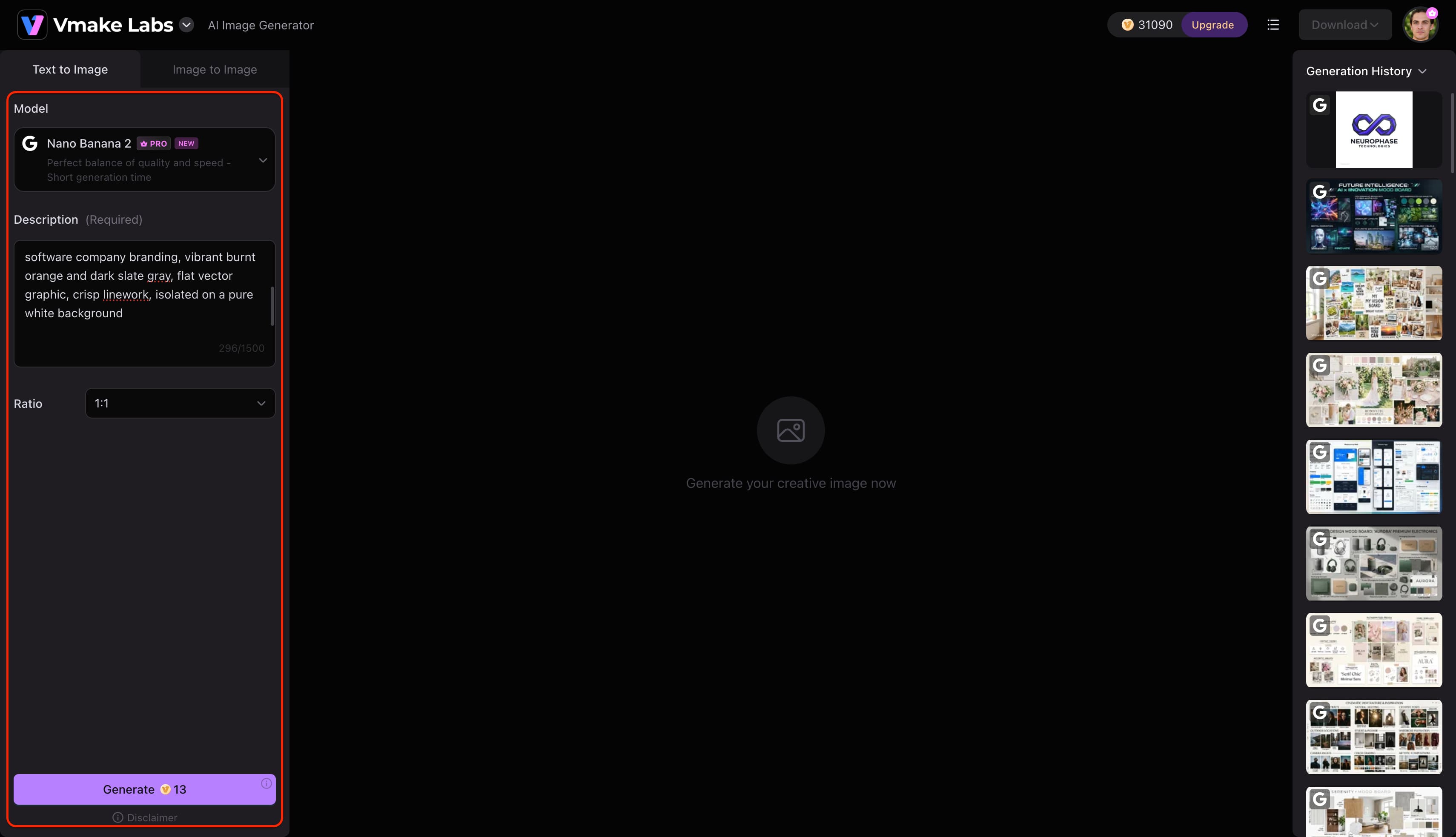
Step 2: Choose an AI model and customise the generation settings
Choose the AI model as per the project requirements. Vmake Labs AI Image Generator supports Nano Banana 2, Nano Banana Pro, Nano Banana, Seedream 4.0 and GPT Image 1. Choose your preferred aspect ratio and click Generate.
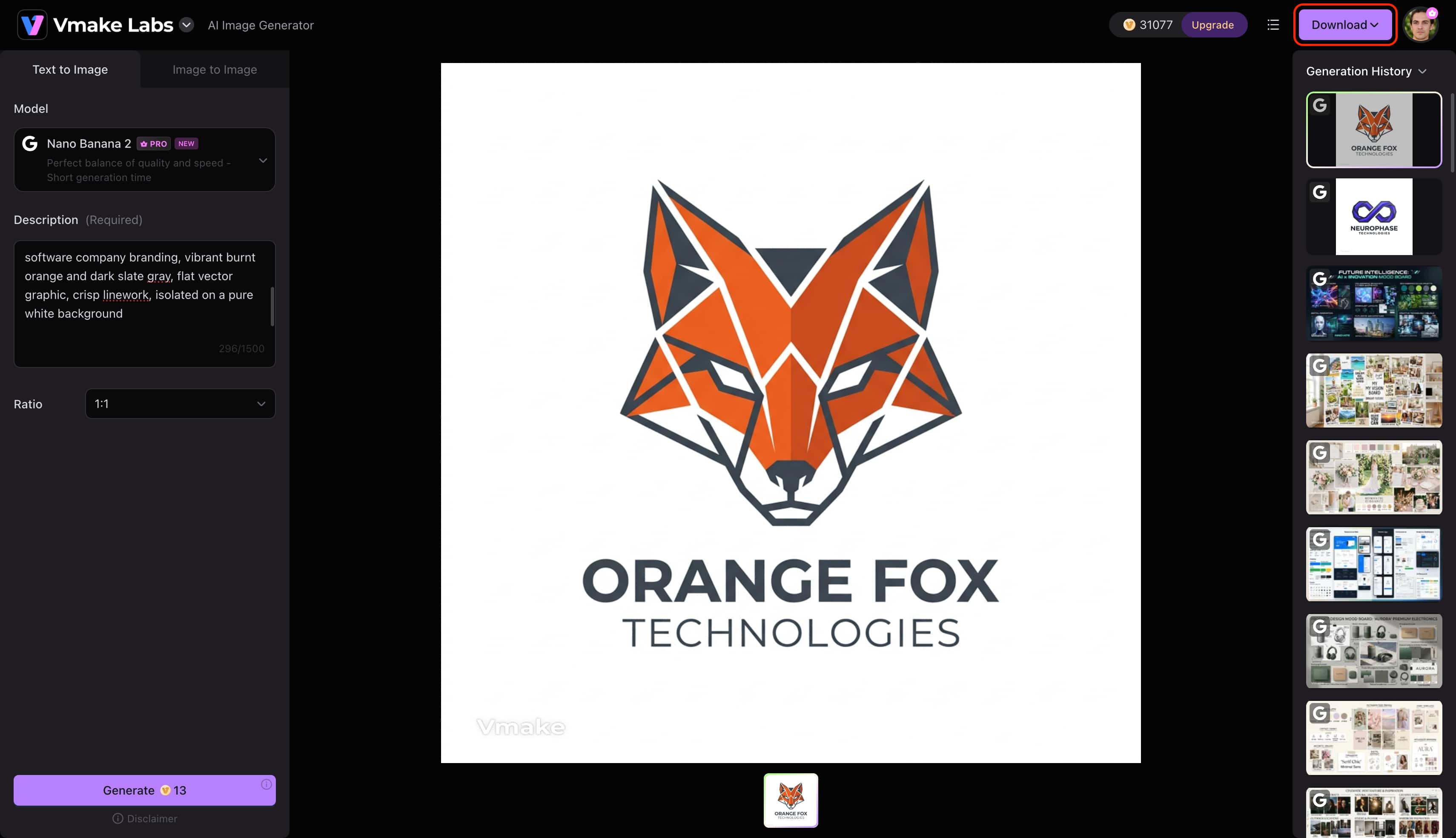
Step 3: Preview and download your image
Review your generated logo concepts in the main preview window to check the linework, composition, and text clarity. Once you are satisfied with the results, click the Download button in the top-right corner to export your high-resolution image file.
Common mistakes to avoid when designing a logo
While it is important to have creative inspiration, it is equally important to avoid structural pitfalls. Here's a table of common design pitfalls and practical fixes to make sure your brand endures.
|
Design Mistake |
Why It Hurts Branding |
Professional Fix |
|---|---|---|
|
Following trends blindly |
Becomes outdated within 2–3 years |
Focus on timeless geometric or typographic foundations |
|
Too many colors |
Reduces recognition & increases print costs |
Limit the palette to 1 primary, 1 secondary, and 1 neutral |
|
Complex illustrations |
Blurs and becomes illegible on small screens |
Apply the "favicon test", if it blurs at small sizes, simplify |
|
Generic stock icons |
Creates a weak, forgettable brand identity |
Use AI tools for ideation, then customize the geometry |
|
Poor typography choice |
Looks unprofessional or mismatched |
Ensure font mood aligns directly with the target audience |
|
Ignoring target audience |
Creates a disconnect between brand and buyer |
Design for customer expectations, not personal taste |
|
Low color contrast |
Fails accessibility and legibility standards |
Check contrast ratios to ensure readability across all devices |
If you have older raster sketches or compressed reference images that pixelate when scaled up, you can run them through an AI image enhancer to restore line clarity and edge sharpness before vector tracing.
Conclusion
The first step to creating a memorable visual identity is to have well-researched logo ideas that are simple, scalable and consider color psychology. Structured mood boards and exploratory sketches offer a purposeful strategic direction before even opening the design software. AI-powered suites help to streamline the early ideation process so teams can quickly test a variety of structural variations. Discover new visual directions, refine creative prompts and build standalone brand concepts with Vmake Labs.
FAQs
What are the best logo ideas for small businesses?
Combination marks that leverage a standalone icon and clean wordmark typography offer the most versatility for growing enterprises. This modular setup allows the symbol to work independently for social avatars or video covers made with an AI thumbnail maker, but still retains the full signature for formal branding.
How do I choose the right logo style?
Ensure visual direction is aligned with industry norms, brand personality and main application channels. While tech startups thrive on crisp minimalism, heritage brands leverage the authority of a vintage badge or monogram.
Can AI generate professional logo ideas?
Sure. Modern AI platforms generate commercially viable concept variants, color treatments and compositional layouts in seconds. Designers use the generated imagery as a high fidelity starting point to refine typography and create clean vector artwork.
What colors work best for logos?
Blue builds trust for finance and technology brands and monochrome black communicates luxury and timeless sophistication. Green is the color of sustainability and natural ingredients, while warm reds and oranges energize and provoke immediate action.
How many logo concepts should I create before choosing one?
Brainstorming 15–20 rough ideas enables creative teams to explore different structural and symbolic paths. Choose three to five completed options from that pool for legibility testing on different screen sizes and backgrounds.
Can I use mood boards before designing a logo?
Before sketching begins, it's necessary to create a mood board to define color schemes, typography hierarchy, and the emotional tone. Grouping visual references early on keeps branding projects focused and avoids falling back on generic design tropes.
You May Be Interested
25 Father’s Day Card Ideas Every Dad Will Love
Father’s Day Gift Ideas 2026: Personalized, DIY & Last-Minute

[2026] How to Turn World Cup Hype into a Marketing Chance
5 Best Valentine's Day Video Ideas for eCommerce in 2026
Best AI Avatar Tools for Business Growth (2026 Guide)